WeCare Finserv
WeCare Finserv — Case Study
A comprehensive FinTech case study by Raveblue — designing and engineering a dual-platform ecosystem featuring a public-facing insurance & loan landing page paired with a powerful internal Admin CRM dashboard. The project covers end-to-end UX research, design system creation, and high-fidelity prototyping for both consumer and administrative experiences.
Problem Statement
The existing operational ecosystem of We Care Finserv suffered from fragmented touchpoints, heavy reliance on manual paperwork for KYC collection, and poor visibility into employee and lead pipelines.
For Customers: Discovering insurance and loan options felt overwhelming due to standard, non-interactive financial forms.
For Admins & Relationship Managers: Managing employee performance, manually processing physical customer documents, and monitoring active partner status was inefficient, slow, and prone to administrative bottlenecks.
The Challenge: How might we create a seamless, dual-platform ecosystem that simplifies insurance discovery for customers while empowering admins with real-time operational visibility?
Objectives & Goals
Our mission was to bridge the gap between fragmented financial operations and a unified, transparent digital experience — for both the end consumer and the internal administrative team.
Methodology
Our Design Process
A structured User-Centered Design (UCD) methodology following the five stages of the Design Thinking framework.
Empathize
Conducted qualitative and quantitative user research via interviews and surveys targeting retail investors and back-office financial workers.
Define
Built personas, affinity maps, and framed core system criteria using the User-Centered Design Canvas.
Ideate
Created user flows and information architectures mapped to both consumer front-ends and administrative back-ends.
Prototype
Constructed low-fidelity structural blueprints moving gradually to polished, interactive high-fidelity user interfaces.
Test
Implemented feedback loops based on operational walk-throughs to optimize administrative speeds.
User Centered Design Canvas
We designed the UCD Canvas to deeply understand the needs, expectations and experiences of all user types — from internal admins to retail consumers — ensuring every design decision was user-centered.
3. Problems
- 1. Relying on scattered emails or messaging apps to gather critical compliance documents like Aadhar and PAN cards.
- 2. No single source of truth for tracking active leads, employee conversions, or branch metrics.
- 3. Customers face complex financial jargon and intimidating onboarding forms instead of smooth, trust-building entry points.
4. Motives
- 1. Hit monthly performance metrics & reduce administrative busywork.
- 2. Manage daily data smoothly without spreadsheet fatigue.
- 3. Dependable financial safety nets without complex, confusing paperwork.
5. Fears
- 1. Data breaches during document collection or compliance errors.
- 2. Hidden insurance clauses, leaking sensitive KYC data online, or rigid contracts.
1. Business
Gain macro-level performance transparency across all active leads and employees from a centralized command console.
2. Users
- • Internal Super Admins
- • Relationship Managers & Field Employees
- • Retail Consumers / Customers
9. Unique Value Prop
Effortlessly turn web-based product inquiries into approved, compliance-verified financial accounts through a beautifully transparent, lightning-fast administrative command ecosystem.
8. Competitive Advantages
- 1. Unified design system for internal employee workflow & external customer acquisition.
- 2. Tailored layout shortcuts matching actual backend financial workflows.
7. Alternatives
- • Excel / Google Sheets pipelines
- • Phone calls / WhatsApp for paperwork
- • Generic off-the-shelf CRMs
6. Solutions
- 1. Clean, metric-driven public landing page
- 2. Powerful secure internal admin panel
- 3. Step-by-step document upload tabs
- 4. Dedicated fields for front/back IDs
- 5. Modular data cards & status pills
- 6. Live performance wheels
- 7. Lead Pipeline & Approval charts
User Interviews
We designed targeted, open-ended questions to deeply understand the workflows, frustrations, and expectations of both internal admins and retail consumers.
Admin & RM Workflow
- 1. Can you walk me through your typical daily workflow from receiving a fresh lead to when a loan or insurance policy is officially issued?
- 2. What are the biggest challenges or bottlenecks you face when collecting KYC documents (like Aadhar or PAN cards) from a new client?
- 3. How do you currently track your active leads? How often do you feel information gets dropped or delayed?
Consumer Trust & Security
- 1. What are your biggest pain points when sharing personal information or uploading identity documents on a financial website?
- 2. Talk about a time you abandoned a financial application or form. What specific element made you stop?
- 3. How do you prefer to hear back from a company after submitting an initial request — phone call or text update?
Dashboard & Tools
- 1. When updating a product detail or checking your monthly conversion performance, what parts of your current software tool frustrate you the most?
- 2. If you could instantly automate or eliminate one repetitive task in your dashboard workspace, what would it be?
- 3. When looking for a financial service (like Health & Wellness Plans), what is the first thing you look for to decide if a company is trustworthy?
Key Insights
- Fragmented Document Gathering Kills Velocity
- The Danger of "Form Fatigue"
- Social Proof Accelerates Trust Instantly
- Dynamic Product Control Prevents Outdated Content
- Administrative Operators Crave "At-a-Glance" Urgency
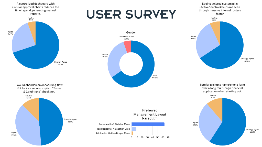
Survey Results
We conducted an online survey to observe patterns and similarities in what potential users — both internal administrators and retail consumers — expect from a modern FinTech platform.
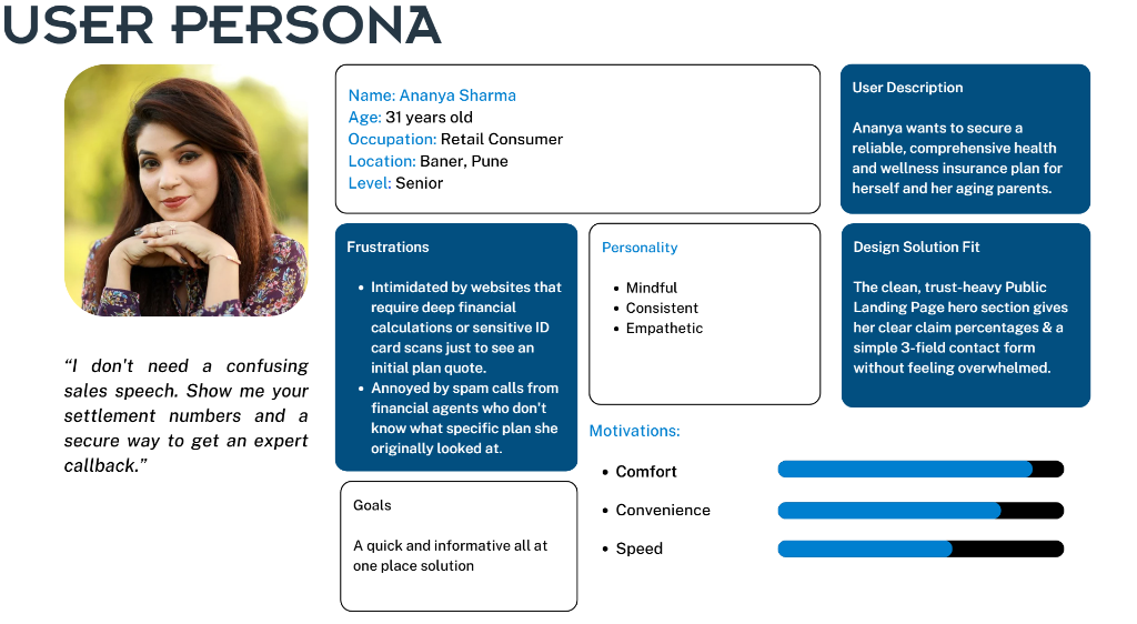
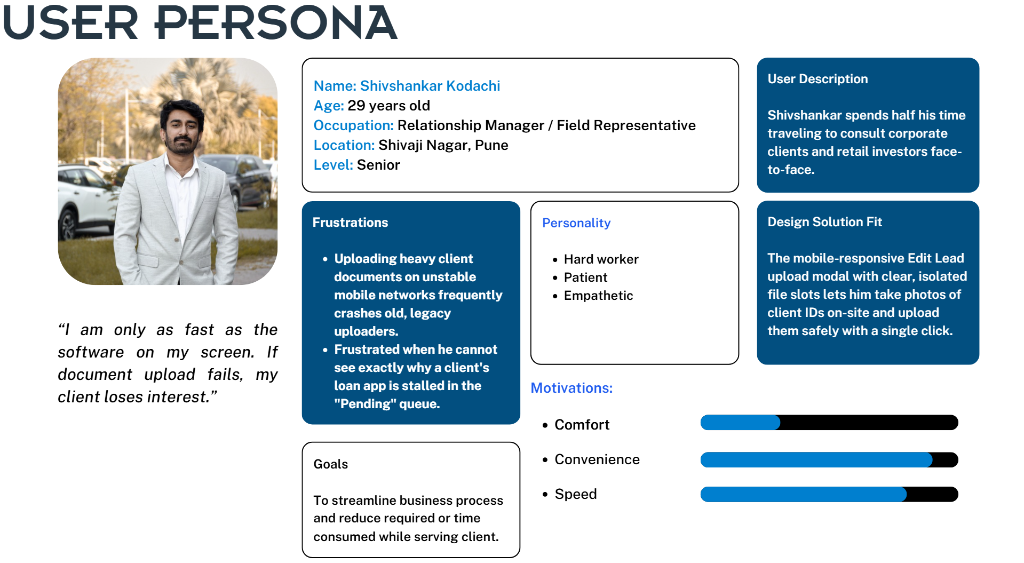
User Persona
Using data from user research, we created personas representing two key user groups — the internal Relationship Manager and the external Retail Consumer — to guide every design decision.
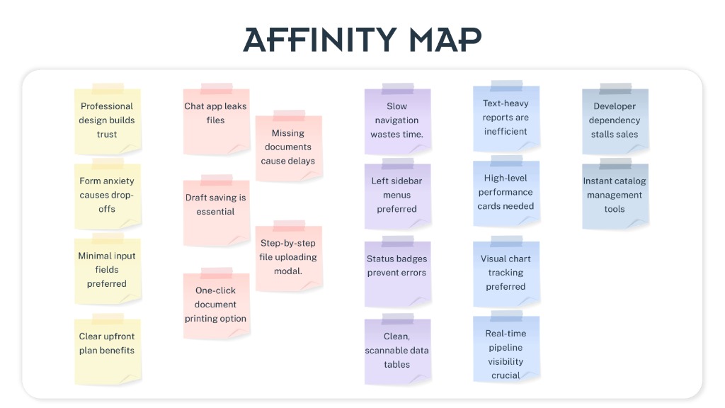
Affinity Map
Affinity mapping was done to categorise all research findings and feature requests under different themes — from trust-building and document handling to navigation patterns and analytics — which further helped in organising the information architecture.
User Flow
We created detailed user flows to illustrate how different users — customers, relationship managers, and super admins — navigate through the platform.
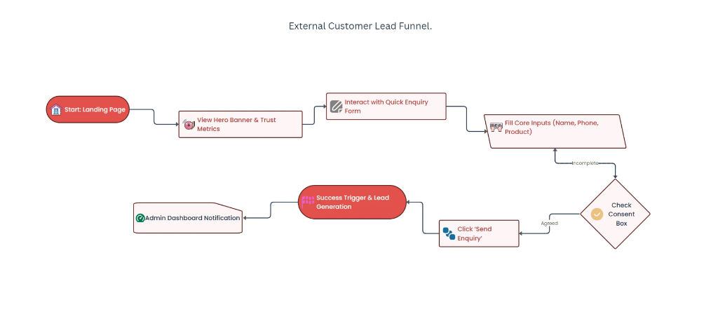
External Customer Lead Funnel
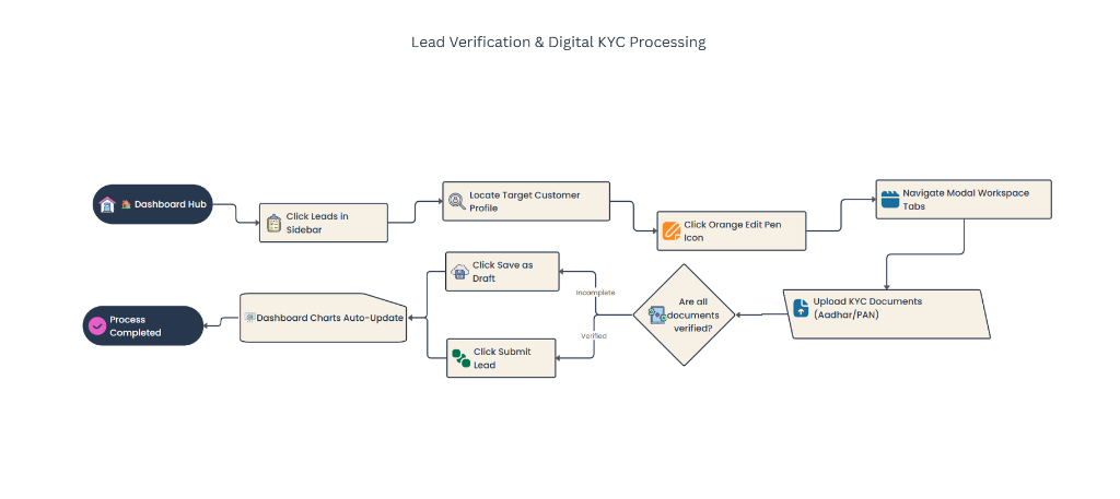
Lead Verification & Digital KYC Processing
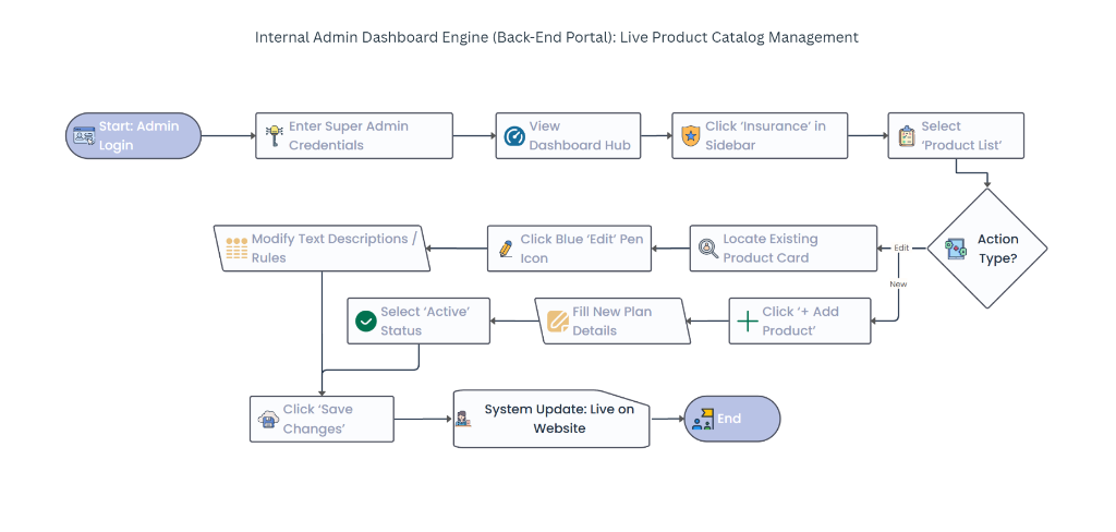
Internal Admin — Live Product Catalog Management
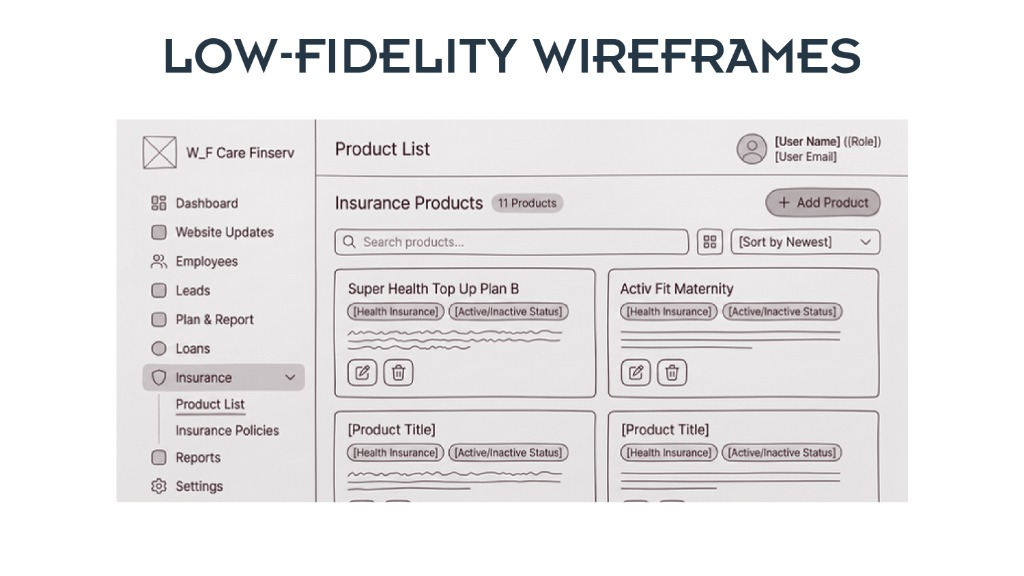
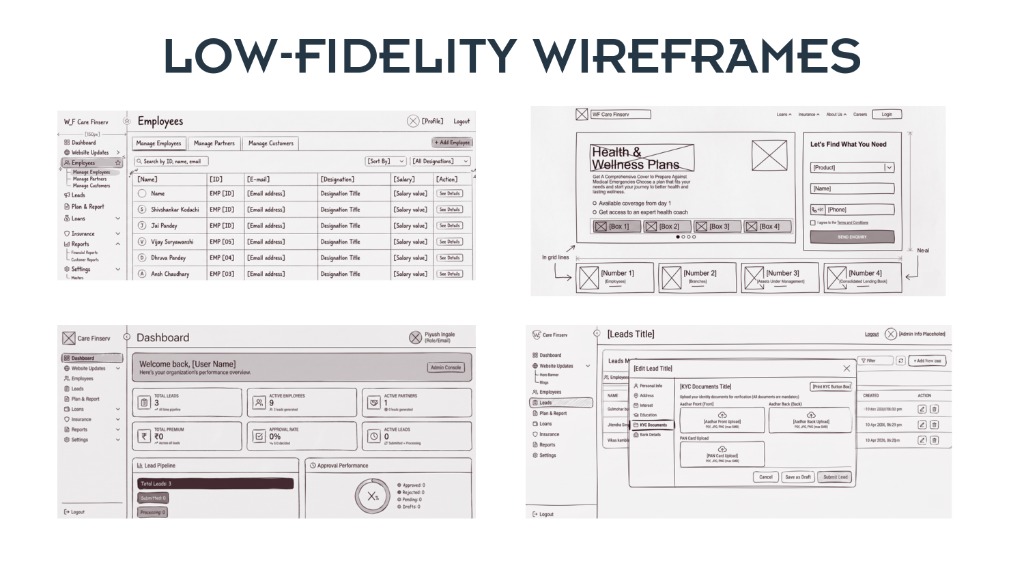
Low-Fidelity Wireframes
We sketched low-fidelity wireframes covering all key screens — from the Admin Dashboard and Employee Management to the public-facing Landing Page and Lead Edit Modal.
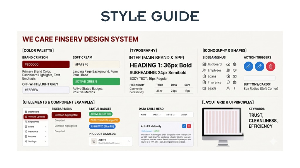
Style Guide
The We Care Finserv Design System — defining the visual language, color palette, typography, iconography, UI components, and layout principles to ensure consistency across the platform.
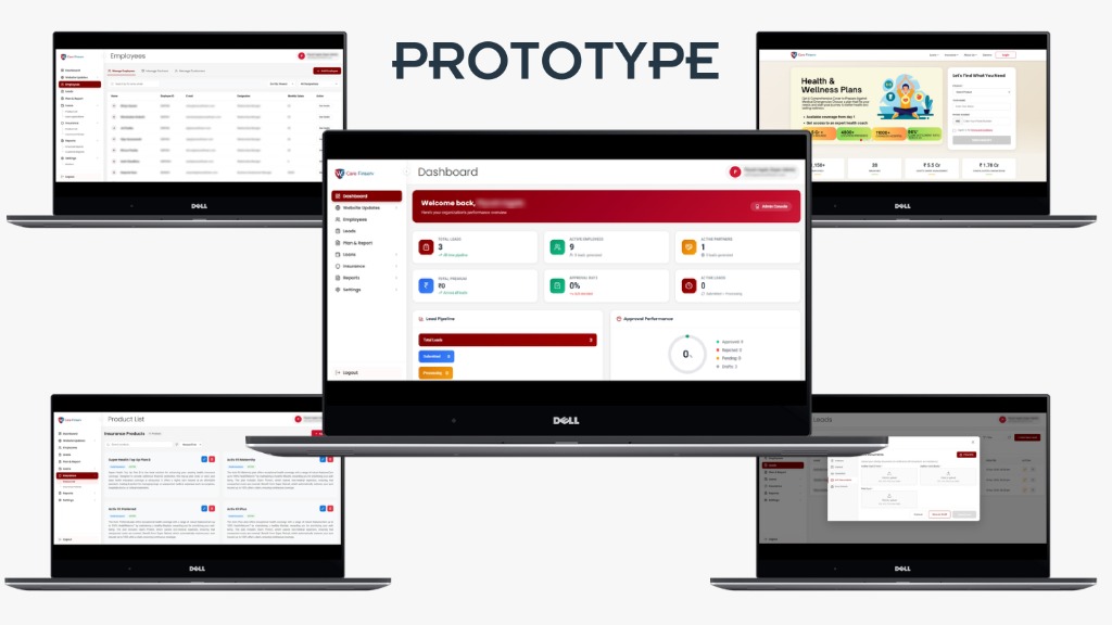
Prototype
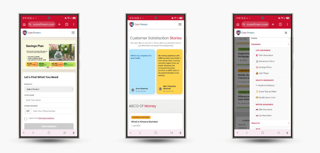
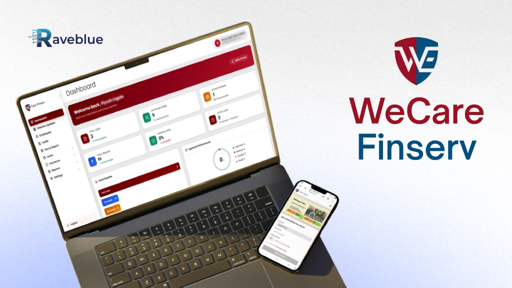
High-fidelity prototypes showcasing the final Admin CRM Dashboard and the public-facing landing page — both on desktop and mobile. These provide a realistic view of the user experience, making it easier to validate visual decisions and prepare for development.
Desktop Experience
Mobile Experience